Functional categories
These new features on the EDGAR web server enable users to analyze and categorize genomic data based on functional categories using datasets from KEGG, COG, and GO.
Under "Functional Categories" in the sidebar, two features, 1. "Funccats Pangenome" and 2. "Funccats Strains", can be found, which focus on options for further annotation/categorisation of your data. Functional category annotations for each EDGAR project are calculated using datasets from KEGG [1], COG [2] and GO [3]. In this page, we cover the usage of these features and provide accompanying technical- and methodological information. The demonstration graphics/screenshots shown here are from the projects “Buchnera” and “Xanthomonas”.
Usage
To begin, the user can select either the “Pangenome” or “Strains” feature. Depending on the specific research question, both can be of use as they present the functional information from vastly different vantage points. “Pangenome” first calculates the genomic subsets of core-, dispensable- and singleton- genes, then subdivides these into KEGG and COG categories. “Strains” shows the functional categories for each organism independently of each other in a side-to-side comparison.
Analysis initiation is identical to the features found in the “GENOMIC SUBSETS” section. Organisms/contigs of interest are selected with a left click, a reference must be selected with right click (See Fig. 1). The “SHOW FUNCTIONAL CATEGORIES” button starts the calculation.
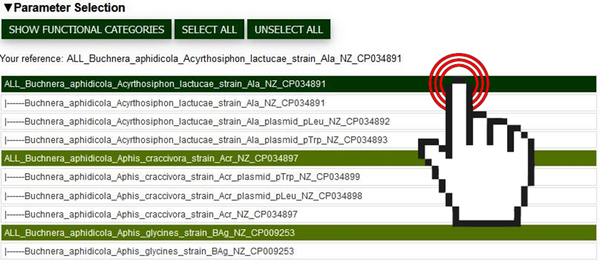
Fig.1 Screenshot of the parameter selection interface where users can pick organisms/contigs of interest for the analysis. The cursor shows the selection of an organism/contig by clicking.
After a few seconds, the EDGAR webpage should display two interactive graphs for KEGG and COG respectively, in addition to a list with the top 20 most observed GO-Terms within the genomic subsets or organisms. “Pangenome” presents the data as a horizontal bar chart with three bars per functional category corresponding to (from top to bottom) the core-, dispensable- and singleton- genes (See Fig. 2). “Strains” presents the data as a comparative stacked bar chart, with each bar representing a selected organism (See Fig. 3).
Bar chart segments (both features) have multiple uses: Hovering over them with the mouse cursor displays additional information for easier data exploration (See Fig. 2). Moreover, they enable the export of segment specific gene sequences and annotation data (.faa format) by simply clicking on the desired segment (See Fig. 3). Each segment is in practice a button that can initiate the download of information conceptually held within it. If desired, GO-Terms can be appended to the annotation-information by holding CTRL and clicking as described. The data exported is organism-category and subset-category specific.
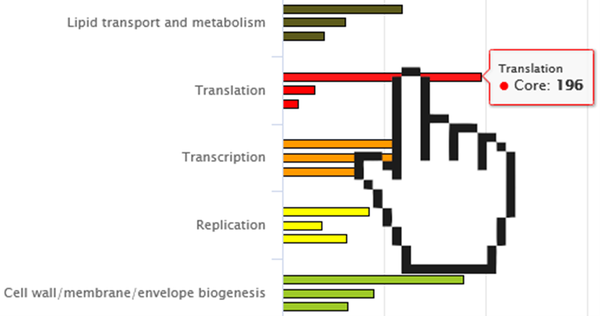
Fig.2 Screenshot of a partial “Pangenome” graph. Core-, dispensable- and singleton- genes are grouped by their categories in sets of three. The cursor demonstrates the ability to hover over a graph section to show more information.
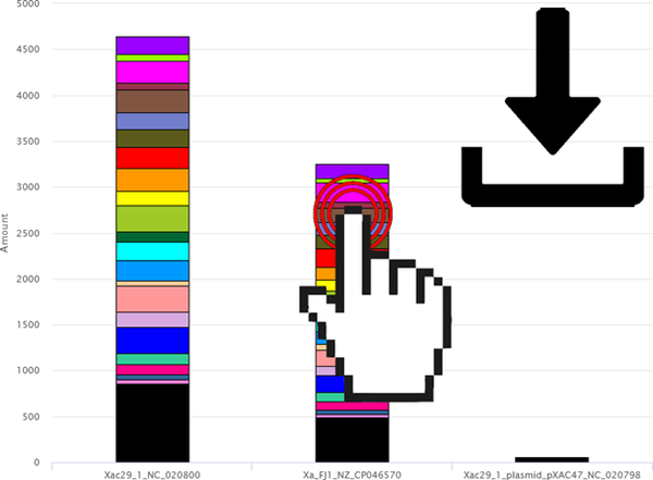
Fig.3 Screenshot of an exemplary “Strains” Graph. The cursor demonstrates the ability to click on a bar chart segment of interest to export the sequence and annotation data within.
The top portion of the displayed graphs/results section contains an array of options. Depending on the project, EDGAR organisms/contig-names can vary significantly in length and detail. To give the user control over how their graph is labelled, the “Strains” feature offers text-boxes which correspond to each analysed organism. Here, a desired X-Axis label can be entered (See Fig. 4-1). The “Update X-Axis” button on the top right of both graphs works in conjunction with these text-boxes and needs to be pressed in order to initiate axis relabelling (See Fig. 4-3).
Right below this, the total amount of found KEGG/COG categories is shown. In case of the “Pangenome” feature, information about annotation consistency is additionally displayed (not shown), as annotation information between orthologs can differ in a low amount of cases. The user should be cognizant that annotation quality and result significance are closely linked. If a selected organism drives up the “inconsistency” percentage by a significant margin compared to others, its annotation should be treated with caution. It should also be noted that the values in “Pangenome” are normalised, meaning here that for each group of orthologous genes, a functional category is only counted once. This eliminates the relative over-representation of categories found in the core- and dispensable- genome, which would drown out other differences.
The raw quantitative annotation data per category can be exported as a .csv file by clicking the “Download Raw Data” button on both features (See Fig. 4-2).
On the top section of each graph (See Fig. 4-3) the "percent" and "amount" buttons can be used as a toggle to transform the data accordingly. The relative percentages relate to the proportional representations of each category within the organisms/contigs or subsets (all functional categories of one individual organism/contig = 100%, all functional categories of one of the three pan-genomic subsets = 100%). The “more options button (≡)” on the very right opens a drop-down which offers the export of the shown graphs in picture and vector formats.
Below each graph, a legend with all categories or subsets is shown (See Fig. 5). The legend names can be clicked to hide/show the different functional categories in “Strains” or the subsets in “Pangenome” respectively.
At the very bottom of the page, a simple list can be found with the top 20 GO terms found within each string/contig or genomic subset (See Fig. 6).
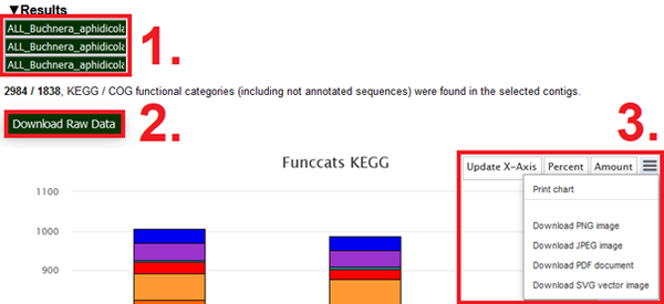
Fig.4 Screenshot of interface-elements above the functional categories graphs. (1) highlights the text boxes in which custom names for the x-Axis can be entered. (2) highlights the “Download raw data button, which initiates the download of quantitative annotation data”. (3) highlights the Update X-Axis button, the Percentage amount toggles and additional options for graph export found in their drop-down menu.
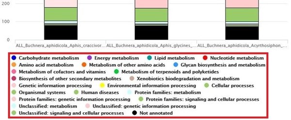
Fig.5 Screenshot of the (here “Strains-KEGG”) legend. Each name can be used as a toggle to show/hide a given data series.
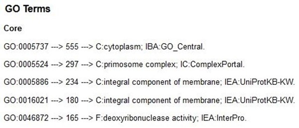
Fig.6 List of most frequently observed (top 20) GO terms with their annotation text (here subset core-genome). On “Strains” this is displayed per strain.
Technical information
Annotation of all genes is carried out with Diamond [4] with datasets from COG [2], GO [3] and Hmmserach [5] using datasets from KEGG [1]. Diamond parameters used are the “--mid-sensitive” setting and a minimum identity threshold of 30%, the best hit was used for the final annotation. This results in high confidence annotations with e-values almost unanimous ≤ 1e-6. Hmmserach was configured with an E-Value cut-off of 1e-6 and the result was subsequently filtered with score value thresholds from KofamKOALA. This was done for easier scalability, the output is identical to KofamKOALA. These pre-calculated results are stored for each EDGAR project for rapid retrieval. As KEGG and GO feature regular updates of their annotations and corresponding datasets, an automatic updater regularly checks for changes to ensure the best possible annotation quality.
The colours for both graphs were retrieved from https://www.genome.jp/kegg/kegg1c.html for KEGG and https://help.ezbiocloud.net/cog-colors/ respectively.
[1] KofamKOALA: KEGG Ortholog assignment based on profile HMM and adaptive score threshold
(2020) doi.org/10.1093/bioinformatics/btz859
[2] COG database update: focus on microbial diversity, model organisms, and widespread pathogens
(2021) doi.org/10.1093/nar/gkaa1018
[3] The Gene Ontology resource: enriching a GOld mine (2021) doi.org/10.1093/nar/gkaa1113
[4] Sensitive protein alignments at tree-of-life scale using DIAMOND (2021) doi.org/10.1038/s41592-021-01101-x
[5] Accelerated Profile HMM Searches (2011) doi.org/10.1371/journal.pcbi.1002195


